
Summary created by Smart Answers AI
In summary:
- PCWorld explains how to navigate Roku’s biggest home screen redesign in over a decade, featuring recommendation rows, quick action tiles, and genre subsections.
- The permanent update aims to improve content discovery but may frustrate long-time users with limited customization options and automatic changes.
- Key adjustments include hiding recommendation rows, pinning favorite apps to Quick Access, and manually updating subscription lists for better accuracy. Detailed instructions are provided below.
Roku is shaking up its home screen with its most substantial changes in over a decade.
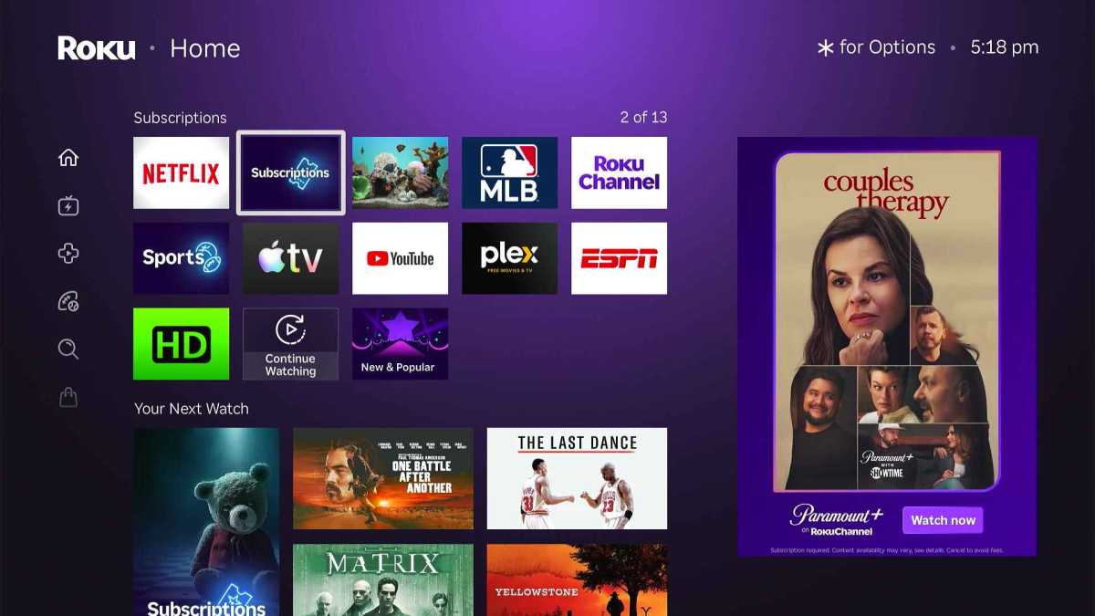
A new design debuting this week adds recommendation rows, quick action tiles, and genre subsections to what was once a simple grid of apps. In some ways it’s an overdue change that helps users make sense of all their streaming options (while also helping Roku make more money), but it’s also likely to polarize some users who’ve grown accustomed to Roku’s stripped-down menu system.
You might not see the changes right away, as they’re rolling out in waves over the coming months. But you might as well prepare yourself, as there’s no going back to the old Roku home screen once the new version arrives. Here’s how you can make it work for you:
Tune the recommendations (or turn them off)
Jared Newman / Foundry
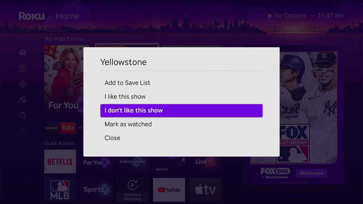
The top of Roku’s new home screen now includes a cluster of “Top Picks for You” suggestions for what to watch. These are supposed to improve automatically over time, but you can speed things along by highlighting a recommendation, hitting the * button on your remote and selecting “I like this show” or ‘I don’t like this show.”
To disable these recommendations entirely, head to Settings > Home Screen > Recommendation Rows, then select “Hide.”
Customize the Quick Access panel (or get rid of it)
Jared Newman / Foundry
Just below those…